
Monday, 9 December 2013

Wednesday, 6 November 2013
Final Drafts of Preliminary Double Page Spread.

This is my improved version of my double page spread. I have chosen to make the border around my text box smaller because i think that it overpowered the rest of the image. Also i have paragraphed my text and added more to it. This is because i think that it didnt have enough text on for a professional double page spread.
Preliminary Draft of Double Page Spread #1

Double Page Spread Preliminary

Tuesday, 5 November 2013
Preliminary Drafts of Contents Pages


Monday, 21 October 2013
Prelimanry Draft of Contents Pages w/ Improvements

This was my first attempt of my contents page, i thought this was good however thought that i lost contrast where my page numbers and contents where at the bottom...

...therefore i added an translucent banner at the bottom of my page so that it outlined the Features more. Meaning that it was easier to read.
Friday, 18 October 2013
Final Prelimary Magazine Covers.


These are my three final mock up coverpages. I have chosen to design these three because i beleive that they portray my magazines ethos. The scriptic writing and the artists which are presented represent the theme in which my magazine covers. I have kept my masthead the same colour for brand identity, this is where the audience can spot this magazine because of its well known brand name. Also i have used monocrome on my magazine covers to try and portray my magazines theme. On the first magazine cover which has the medium close up of Kanye West, i have used monocrome but have however incorporated a few colours also to test how it would look.
Wednesday, 16 October 2013
Preliminary Front Cover

Monday, 14 October 2013
Evaluation of PreLim
Evaluation of the Preliminary Exercise
1. In what ways does your media product use,
develop or challenge form and conventions of a school magazine?
In my magazine I used form and convention by using the
medium close up in the magazine. This made the main image stand out on the
page, making it the centre of attention.
My magazine cover
shows the schools ethos by demonstrating a hard working pupil on the front
cover. This shows that the school’s pupils are hardworking and dedicated. I
chose to develop this convention because I think that it will help others in
seeing what our school is like.
From my audience
feedback I have learned that my magazine cover has to be as full as possible, I
mean by this that I have to minimise the amount of dead space on the page.
Another thing
I have learned from my audience feedback is that I have to include more
information on the front cover to tell them what is inside unless it will not
draw their attention to the magazine.
To
finish my preliminary product I used fireworks, this was a new version of
fireworks which mean that I had to learn how to use different tools before
starting such as the blur tool, this helped me improve the magazine cover.
Wednesday, 2 October 2013

Wednesday, 18 September 2013
Peliminary Fonts
This is one of the fonts in which i may have chosen for my school magazine, the reason i have chosen this font is because it fits in with the school theme.
This is the second font that i may use in my school magazine cover, i have chosen this because i think it would make a statement as the masthead, my reasons for this are that its a bold magazine.
This is my final font in which i may be using for my school magazine cover, the reason i have chose this font is because i think it is eye catching, this is because of its Sans Serif nature. I also think that this will be a good edition to my magazine and will draw in readers.
Peliminary Research

This magazine cover is not very good, this is because the font stands out too much from the background, the colour scheme is also to varied. It looks messy and the font is not too good. The last reason in which i do not like this magazine cover is because the picture stands out to much from the background.
Friday, 6 September 2013
Analysis of Existing Magazine Contents Pages.
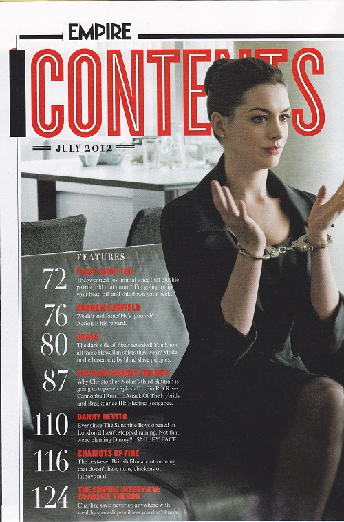
On this contents page the title 'CONTENTS' is in the same font which is on most Empire magazine contents' page. This keeps the same theme so that the readers do not get confused. The colour theme is simple. The use of red makes the subtitles stand out from the picture. However the picture claims dominance over the contents page cleverly. They have chosen the picture because it has space to the left and above Anne Hathaway, this giving room for the contents and the title. Also the picture foreshadows what her personality will be portrayed as in the film The Dark Knight.

On this contents page the magazine is too simplistic. It does not give a good interpretation of what is inside. The picture of Obama is a medium close up. The picture does not make him look like the president of the USA it makes him look more like a celebrity. The subtitles stand out because they are in a different font then the rest. This is a good point to make because it is simplistic for the viewers to see.
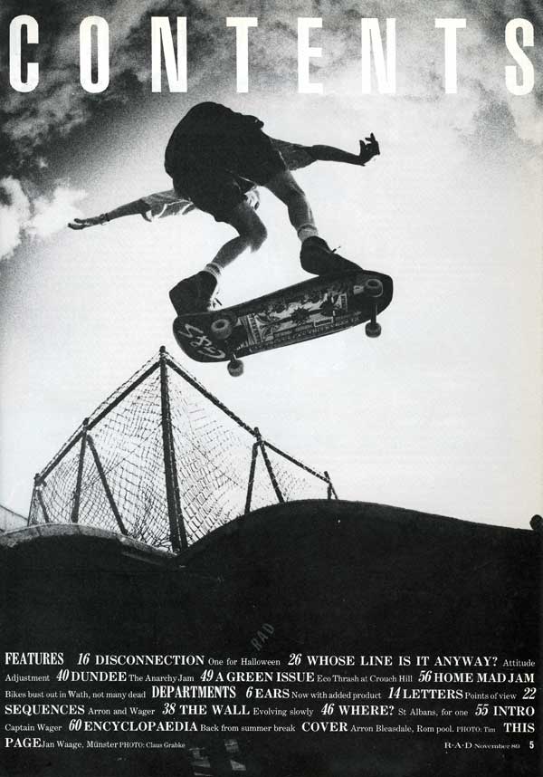
The contents page on this magazine is good because it keeps the same simplistic theme, it also blends in well. The skateboard and the fence give it a rundown feel and aim it at indie/skateboarders. The contents are at the bottom of the page, this is different but good. The magazine has a simple colour theme of just black and white. This makes it so it doesnt stick out and it just bends in.
Thursday, 5 September 2013
Analysis of Existing Magazines Double Page Spread.

This double page spead is effective but simple, the colour scheme is black white and gold. This also corresponds to the colours in which the music band are wearing. Also the main image on the double page spread has blurred out the rest of the group and kept the band leader as normal. This enhances his leadership and comtemplates him leaving, or staying. Another point is that the middle paragraph has been highlighted, suggesting its importance, attracting the readers eye so that they want to carry on reading.

This magazine double page spread is very attracting. The colour scheme, once again, consists of 3 colours, black white and red. This keeps it simple and makes nothing stand out. Except for the "L" in the middle of the page. This represents her name, Lady Gaga. The main image also portrays Lady Gaga's image, the strange sexy look.

The reason i have chosen this 2 page spread is because of the simple colour theme, it represents a simple
Wednesday, 4 September 2013
Introduction
Hello! My name is Jordan Cleaver, welcome to my Blog! Over the next few months I will be researching, planning and designing a new magazine cover, contents page and double page spread for my AS Media Studies.
![]()
 |
| This is me |
Monday, 2 September 2013
Analysis of Existing Magazine Covers from my Chosen Magazine Genre.

COLOUR
The masthead colours have kept the same colour as Harry Styles' face. This makes it look sensible and sophisticated, also the colour theme only consists of two colours, black and white. This gives a sensible classic feel towards the magazine cover, also reflecting what the magazine might be like for new buyers. The position of the masthead is also important because when they are stacked in a shop, they are on top of eachother, the position helps because thats all they will see in the shop so they will recognise the magazine. The colour of the subtitles along the bottom however could potentially be changed so that it fades from white to black, this is because it contrasts with the picture making it harder to read.
LAYOUT
With there being no pug or kicker suggests that the main story is most important and it will be all readers will want to know about, they are not advertising other story's which are inside of the magazine. There is no barcode on the front of the page suggesting that they dont want to clutter the page, meaning that the front page will be the main seller. Also the person in the image is in the spotlight which suggests that he is superior to everyone else.
LANGUAGE
The dialogue used in the magazine cover is very soft, this suggests that it is a magazine for girls maybe. The reason for this is because of the subtitle, 'i like girls my own age too'.

The splash on this magazine cover is cleverly layered. The first G and A are behind the celebrity and the second G and A are in front. This shows that they do not really have to tell the readers who it is on the cover because she is very well know. The colour scheme is also very bold. It only consists of Red , black and white. This is good because it stands out when it is on the shelves, however it does not look silly with a lot of different colours. Lady Gaga's pose on the main image is a medium long shot. This means that you can see all of her from the legs up. Her pose is very seductive towards the reader. This maybe meaning that the magazine is aimed at males.
There is no Pug on the page. The kicker, which also keeps to the colour scheme, advertises another story which is inside the magazine. The masthead which shows which magazine it is, is in the corner of the newspaper as it is on most Q magazines. This follows the theme because if they changed the normal Q box then readers would not know which magazine it is and they would not buy it. They would buy a different magazine that interests them.

The main image on this magazine cover is a medium close up. The facial expression is a serious one, and gives a sophisticated, serious, slender look. Once again the magazine uses a 3 colour colour theme. This keeps it simple and makes it attractive to look at. Jay-Z is layered behind the text, this suggesting that maybe he does not need to be the centre of attention; or that the magazine is not as developed and well known therefore need to be recognised more. The barcode is in a awkward place on the front of the cover. The reason why it is on the front and not on the back is because of advertisements which are on the back. That is the money maker for magazines such as this one. Jay-Z also is looking in a direct gaze to the reader suggesting that he is talking to y
Sunday, 1 September 2013

Subscribe to:
Posts (Atom)