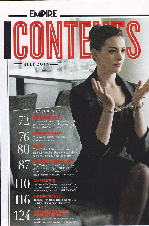
On this contents page the title 'CONTENTS' is in the same font which is on most Empire magazine contents' page. This keeps the same theme so that the readers do not get confused. The colour theme is simple. The use of red makes the subtitles stand out from the picture. However the picture claims dominance over the contents page cleverly. They have chosen the picture because it has space to the left and above Anne Hathaway, this giving room for the contents and the title. Also the picture foreshadows what her personality will be portrayed as in the film The Dark Knight.

On this contents page the magazine is too simplistic. It does not give a good interpretation of what is inside. The picture of Obama is a medium close up. The picture does not make him look like the president of the USA it makes him look more like a celebrity. The subtitles stand out because they are in a different font then the rest. This is a good point to make because it is simplistic for the viewers to see.
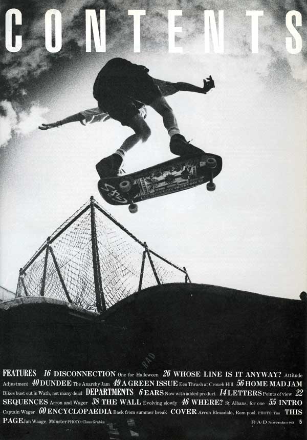
The contents page on this magazine is good because it keeps the same simplistic theme, it also blends in well. The skateboard and the fence give it a rundown feel and aim it at indie/skateboarders. The contents are at the bottom of the page, this is different but good. The magazine has a simple colour theme of just black and white. This makes it so it doesnt stick out and it just bends in.
No comments:
Post a Comment